In my previous blog, I provided a model of COVID-19 based on the U.S. population. Running that model demonstrates how social distancing can flatten the curve by reducing the load on the U.S. health system. The system's capacity on any day is increased. This can be seen in the following data graphics.
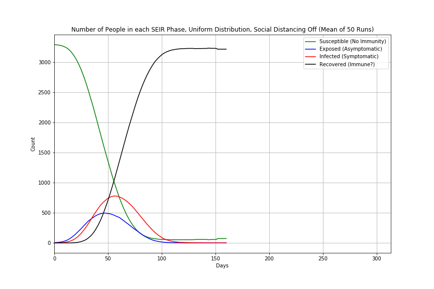
Single model runs are a useful demonstration but the value of agent-based modelling can be found by simulating a variety of scenarios. Plus a single run could be a one-off situation. The model I created is stochastic so better to conduct multiple runs. Figure 1 shows the results of the values for each day of the number of agents in each of the SEIR phases. Social distancing was turned off and the number of days spent in the exposed phase was selected using a uniform distribution between the low and high numbers (defaults to between two and fourteen days). Fifty runs were conducted to obtain the mean.

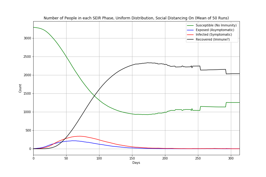
Compare this to Figure 2 where the only difference is to implement social distancing.

The curve has been flattened. To do so to the point at which there are no longer exposed, asymptomatic, or infected symptomatic agents means the pandemic length is about twice that of no social distancing.
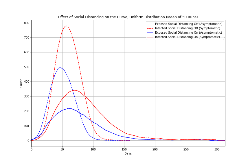
Figure 3 provides a look at just the exposed and infected agents.

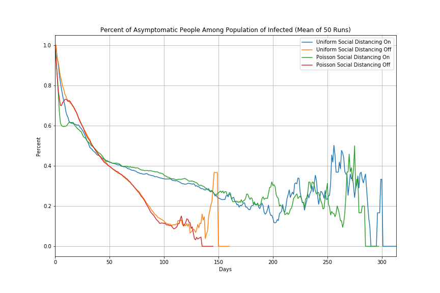
There has been some discussion in the press regarding the number of asymptomatic people among the population. Figure 4 shows that this number is probably dynamic, decreasing as the virus works its way through the population and runs out of people to infect.

This has been a look at some of the analysis that can be done on a simple model. Remember that this model like all other models is wrong as it is merely a representation of reality, but I hope you found it useful.
